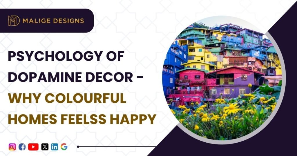
Walk into a home with bright colors, playful textures, and warm lighting, and there’s usually an immediate emotional response before you’ve consciously registered any single design choice.
That reaction is what “dopamine decor” refers to – the idea that color, pattern, and texture can be used deliberately to lift mood, not just to look good in photos.
The term borrows from dopamine, the brain chemical linked to pleasure and motivation.
Unlike a purely neutral, minimalist approach to home interior design, dopamine decor leans into color and personality on purpose, on the theory that a home shouldn’t just look composed – it should genuinely feel good to be in every day.
The Actual Psychology Behind It
Color affects emotion more directly than most people realize. Bright, warm tones – yellow, orange, pink – tend to read as energizing and associated with positivity and creativity.
Cooler tones – blue, green – tend to read as calming and balanced. This isn’t purely subjective; it’s a large part of why cafes, creative studios, and hospitality spaces use color so deliberately, and the same logic applies just as directly inside a home.
Part of why colorful interiors tend to feel more positive isn’t the color alone – it’s personalization.
A home that reflects someone’s actual taste and memories reads as more authentic and comforting than one that’s simply “on trend,” which is really the core idea behind dopamine decor : less about chasing a perfect look, more about genuine emotional connection to the space.
Popular Color Combinations
- Yellow and white – positivity and warmth balanced by a fresh, airy base, well suited to living rooms and kitchens.
- Pink and orange – a playful, energetic pairing that works especially well in bedrooms or creative spaces where a bold, youthful feel is the goal.
- Blue and green – a nature-inspired combination that reads as calm and refreshing, a strong fit for bedrooms and quieter corners of a home.
- Purple and beige – richness and creativity from the purple, softened and balanced by beige, landing somewhere between luxurious and genuinely cozy.
Room-by-Room Ideas
- Living room. As the most social space in most homes, it’s a natural place to experiment. Small, reversible additions – vibrant cushions, a statement artwork piece, a colorful rug, an accent chair – shift the room’s energy without a full renovation. Even a single accent wall can meaningfully change how the space feels.
- Bedroom. Softer shades tend to work better here than bold saturated color – pastel pink, peach, lavender, sage green, muted blue all add personality while still supporting rest. Layering color through bedding, curtains, and wall art gets the warmth without making the room feel visually heavy.
- Kitchen and dining. Kitchens default to neutral more often than any other room, which makes small vibrant touches – a colorful backsplash, bright cabinet fronts, pendant lighting – stand out more. Dining spaces specifically benefit from warm tones like terracotta or mustard, which read as cozy and inviting rather than sterile.
How to Add Color Without It Feeling Chaotic
The biggest misconception about this approach is that every surface needs to be bold. It doesn’t – the actual goal is emotional warmth, not visual noise.
The 60-30-10 rule still applies here just as it does in any color-conscious room: roughly 60% a neutral dominant base, 30% a secondary color, and 10% a bold accent. This creates a room that feels genuinely exciting without tipping into overwhelming.
Common Mistakes Worth Avoiding
- Too many bright colors with no underlying consistency tends to read as cluttered rather than joyful – color needs a base to work against, not to compete with itself.
- Ignoring how lighting changes color is a common trap – the same shade reads noticeably differently under natural daylight versus warm artificial lighting, which is why testing a color under your room’s actual lighting matters more than trusting a paint chip or a screen.
- Copying a trend without checking it against your own taste often produces a room that photographs well but doesn’t actually feel comfortable to live in day to day. The best version of this style is personal, not borrowed wholesale from someone else’s Pinterest board.
The Bottom Line
A home shouldn’t just impress guests walking through it once – it should make the people actually living there feel good every day.
Thoughtful, balanced use of color is one of the simplest and most cost-effective ways to make that happen, whether you lean toward bold statement choices or soft, personal accents.
When we design residential spaces at Malige Designs, color and mood are part of the same conversation as layout and material – not decided separately, and not something you have to choose between and structural function.